Analysis - How it happens
When using FPTP with multiple parties there are a number of factors influencing the seats gained by the votes cast, or simply - where do all the votes go?
- Price of seats: To win a constituency seat all you need is one more vote than the party coming 2nd - and the winner takes all. When there are several viable contenders for a seat, the pass mark (2nd place level) goes down, for example if 4 contenders you can win with just 26% of votes. The 2nd place pass mark is a critical feature of FPTP when used with multiple parties and is included in the Vote Price of Seats distribution, and Use of Votes, in the election statistics below.
- 1st place including Majority or Margin of Victory: (MoV also called Plurality). 1st place votes are those that the winner obtained, and include the votes in excess of the 2nd place, which to maintain FPTP's fantasy we call the MP's Majority (if used correctly, as in Government Majority, any MP with less than 50% vote share would have a negative "Majority", which doesn't sound too good on election night – also see When is a Majority not a Majority). High "Majorities" are considered good, but are just a waste of votes and election over-kill, you only need 1 extra vote, and at division lobby time, the MP's vote is "one", regardless of Margin of Victory (how about Card Voting based on MP's votes?).
The Election Statistics below include a breakdown of the winning party's Use of Votes and these are shown as MintoWin and Majority. - 2nd place: These are the votes that create the pass level that the winner has to cross. All 2nd place "pass mark" values (regardless of party) are used in the distribution of Vote Price of Seats (see below). From a party's view, where they come 2nd isn’t a win, but they do set the “pass mark”. From a winning point of view, these votes are lost to creating 2nd places, the value appears in the Use of Votes below as 2nd place.
- 3rd place plus: these are votes of 3rd, 4th or lower place and have no influence on the constituency win, but would be included in the Majority calculation if done correctly. From a parties winning view these votes are lost to 3rd, 4th or lower place and are just in the mix of fragmented opposition. They appear in the Use of Votes below as 3rd place +.
- Fragmentation of choice: under FPTP there should be a choice of just party A or B, but now it's become of A or B C D E and more, and the greater the fragmentation the worse FPTP performs. I have tried to quantify the fragmentation by using the ratio between “3rd plus” and "2nd place” votes (C D E etc. against B) across the whole election and called it "national Fragmentation of oPosition". See "The illusion of 1 person 1 vote - Full verion" in History and Other Links for more detail. Term below is nFoP
- The number of seats contested: not a big influence but votes are not attributed to no hope constituencies
The price of seats (1 above) varies from election to election depending of the political environment at the time. For example if there's lots of dissent, dissatisfaction and “I’m politically homeless” etc., be this real or manufactured by media interests, the number of viable alternative parties at constituency voting time goes up, and under FPTP the vote price for a seat goes down. For any election the various seat prices and the numbers occurring can be shown as a distribution graph, as in the example Election Statistic below. The distribution gives a summary about how easy or hard the election was to win, remember from the Challenge - the vote share that elects the winning party has remained in a narrow band over the last 50 years, it’s the seats gained that have varied dramatically.
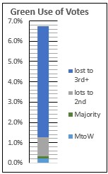
Any party's vote share can be broken down (items 2 to 4 above), for example the Green Party in 2024, as adjacent. They gained 4 seats with 6.7% vote share that breaks down as: MtoW 3.05% ~ Majority 1.86% ~ 2nd 13.87% ~ 3rd+ 81.21% (note: % of 6.7% so disregard scale). Another example is UKIP in 2015 when they gained one MP for 12.6% of the national vote. The breakdown of UKIP’s 12.6% share is: MtoW 0.42% ~ Majority 0.09% ~ 2nd 27.87% ~ 3rd+ 71.62%. But generally the breakdown has been applied to the election's winning party and shown as Use of Votes in the election statistics below.
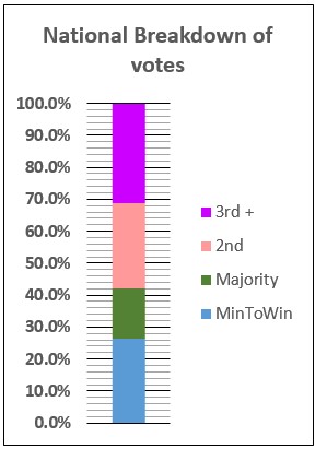
The degree of election fragmentation (5) nFoP is the difference between “3rd plus” and "2nd place”, as illustrated by the adjacent image. The 2024 election has a record high of 118.4%, previously it has been around 60% i.e. the 3rd+ value lower than 2nd place. This new high shows the scales have tipped from a nominal 2nd party towards the many “other parties”, making a 2 party voting system utterly inappropriate.
The level of contested seats (6) is shown as a percentage of the total posible. Another interesting statistic included is the Gallahar Index for the election i.e. the overall balance of representation given by a ratio of %votes to %seats - see Measuring Failure for detail.
Notes: most information in the Election Statistics is about the winning party, but the nFoP and Gallahar Index are about the election as a whole. The winner's seats to votes balance often makes the biggest contribution to the Gallahar Index, but not always e.g. 2010 winning Conservative 11 difference LibDems -14.2
Example Election Statistic
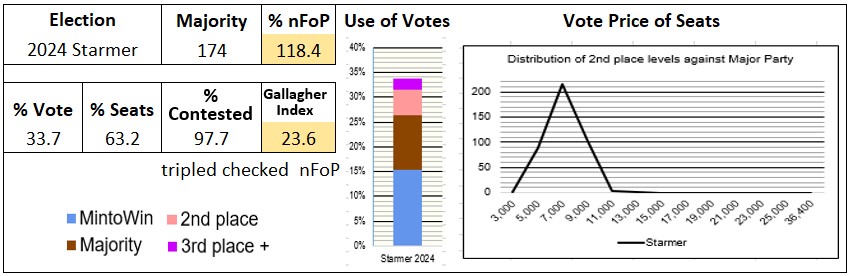
The Use of Votes breakdown is as described in 2 to 4 above, but the distribution Vote Price of Seats needs more explanation. A set of Excel formulae examine the 2nd place vote at all constituencies where the major party won i.e. the vote level the winning party had to beat in order to win, and the formulae count the number of them falling within bands as shown on the horizontal axis e.g. 0 to 3,000 votes, 3,000 to 5,000 and 5,000 to 7,000 etc. and the count number can be read from the vertical axis. In general a hill skewing to the left means lots of easy wins (or cheap vote seats) were available, if to the right lots of expensive ones, and a hump in the middle nothing exceptional but its height is important. Here the vertical axis value is high as Starmer enjoyed a record high number (215) of cheap seats, and to maintain consistency all charts use the high value even though unnecessarily high.
The 2024 Starmer election also gave a record high nFoP (national Fragmentation of oPosition) value of 118% that favoured him.
An element of negative feedback?*
Although in theory cheap seats are available to all parties, under FPTP it’s only those with the critical mass of constituency vote densities (as opposed to parties with lots of votes, but spread across the country) that benefit, that's traditionally Conservative and Labour and hence stabilising the system in their favour. This is a claimed advantage of FPTP, it keeps the small parties out, but what constitues a small party, have Reform UK now become a big party. There are currently (December 2025) polls on voter intensions putting Reform UK on 31% Labour 21% and others trailing below and suggesting that Reform UK could benefit from FPTP, especially in a fragmented environment and so lots of cheap seats. Another factor is gaining critical mass of constituency vote densities and if regions follow the trend, rather than an equal spread, then Reform UK can become a big benefactor of FPTP and its possible negative feedback.
*Wikipedia - Negative feedback occurs when a function of the output of a mechanism is fed back in a manner that tends to reduce the fluctuations in the output, regardless of changes in the input or other disturbances.
~ ~ ~ ~ ~ ~ ~ ~ ~ ~ ~ ~ ~ ~ ~ ~ ~ ~
I have checked various figures against both the sources given in the footer, plus the BBC at times and there are sometimes a few minor differences - and there's a surprising note at the House of Commons library as below:
There’s a statement on the House of Commons Library
“Unlike many other democracies, the UK has no official body that collects and publishes official results
straight after an election.” The statement continues with a description of what other countries do and concludes “But
the UK’s Electoral Commission’s remit is more limited when it comes to collecting and publishing results:
they are not required to publish detailed results but must produce “a report on the administration of” each
“election or referendum”.”
The statement continues to explain that there are no standards around constituency data presentation, not
even to be machine readable, and it requires teams from the library to process results and compare them
with information from news organisations. I first saw this note in August 2019 and so far (Nov 25) nothing's changed.
Comparing Election Statistics
For the true enthusiast of the FPTP Challenge it is possible to look at the stats behind the Actual Results and the various anomalies to find what might cause them.
Tap / click on one of the adjacent elections and a page will start showing the stats of the chosen election, and those for all other years can be compared by scrolling.
Example query and possible explanation
Query - Starmer's 2024 record low vote share gave him a very similar seat share to Blair’s record high one in 1997, but the vote shares are dramatically different. If you compare this pair of results you can get some idea of how this happened and led to such an absurd and illogical result – it’s more about a game of chance than voter aspiration.
Possible explanation – they both had an easy time with seat prices, hence both high number of wins, but Starmer had an easier time and so easy (combined with low “Majorities”) that he got the worse Gallagher Index on record too. Another standout is that Starmer didn’t “waste” lots of votes on big majorities. The political environment and a record high nFoP, together with no general positive drive for Labour, but more an "anything but the Conservatives", meant no big Labour "Majorities", but tactical voting would have re-adjust the balance taking "no hope" votes from other parties and giving to Labour.
You could say Starmer's votes were used more efficiently, but on another day, and another set of chances, in the electoral poker game of FPTP, a different result occurred for poor old David Cameron in 2010 - he got a slightly higher vote share than Starmer, but got the lowest ever seat share. At that time seat prices were high, and while he was good about not wasting votes on big “Majorities” he was very carless about 2nd and 3rd+ votes, but he did sacrifice himself for a better Gallagher Index than Starmer or Blair.
~ ~ ~ ~ ~ ~ ~ ~ ~ ~ ~ ~ ~ ~ ~ ~ ~ ~
But the big question is: - to what extent does this happen in proportional voting systems?